Top Peak Travel Borneo is a boutique travel company aimed at giving adventurous travelers what they want – personalized services and advice for their holiday travels in Malaysian Borneo. They service all the beat attractions if the region. From the heights of mighty Mount Kinabalu through the mysterious jungles of Kiau to Sabah’s beautiful beaches.
Using a combined twenty years of tourism experience, the owners of Top Peak Travel Borneo offer trips based on clients‘ time and interest’s from 5 star white sand beaches to tough but rewarding treks through the heart of the island.
Top Peak Borneo Branding Considerations
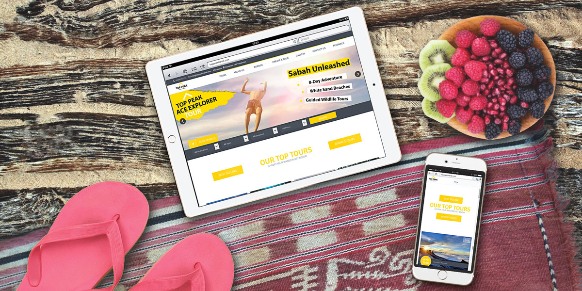
Color plays an important role in viewers perception of a brand, and I wanted Top Peak Travel Borneo to pop! An irreverent and striking yellow and heavy slab font were used to make a bold impression. Pairing these elements with whimsical imagery and some vintage travel design formatting helped craft their memorable look.

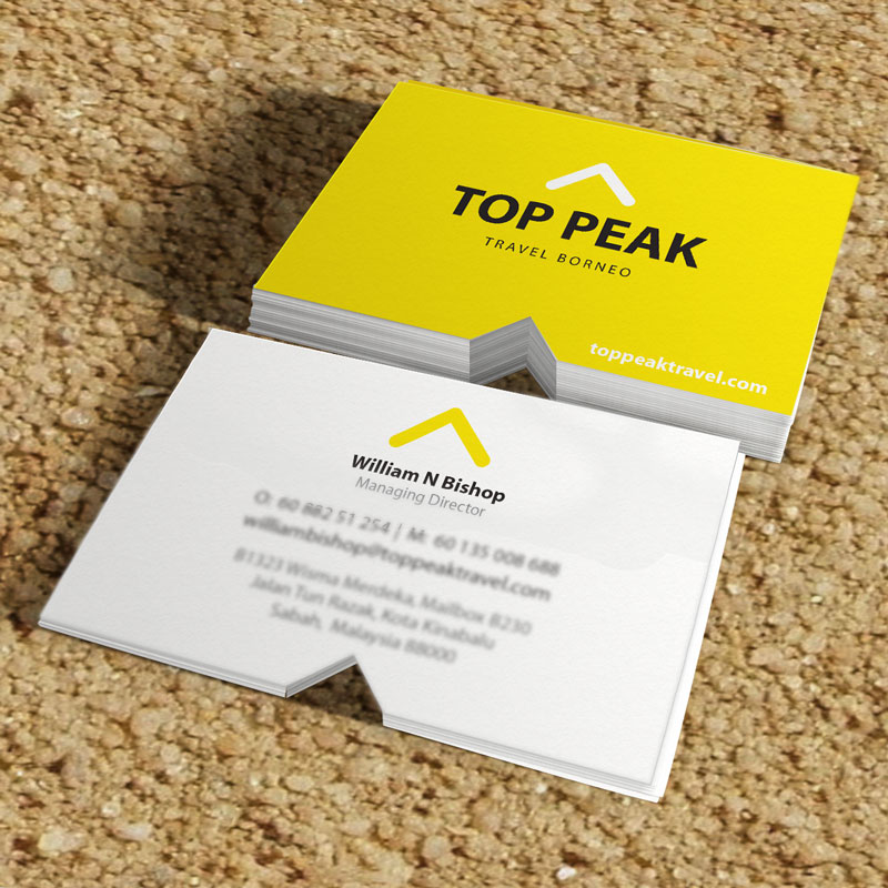
Business cards are often the first introduction to a brand and the most personal way to spread contact information. I wanted this intro to be as unique and playful as the Top Peak Travel Borneo brand. To achieve this, I went with an irregular shape and size. The cards were made a little more square, a 4:3 aspect ratio, and feature a die cut notch mimicking the “peak” element in Top Peak’s logo.
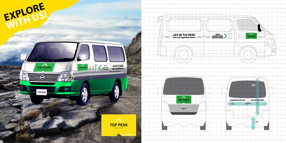
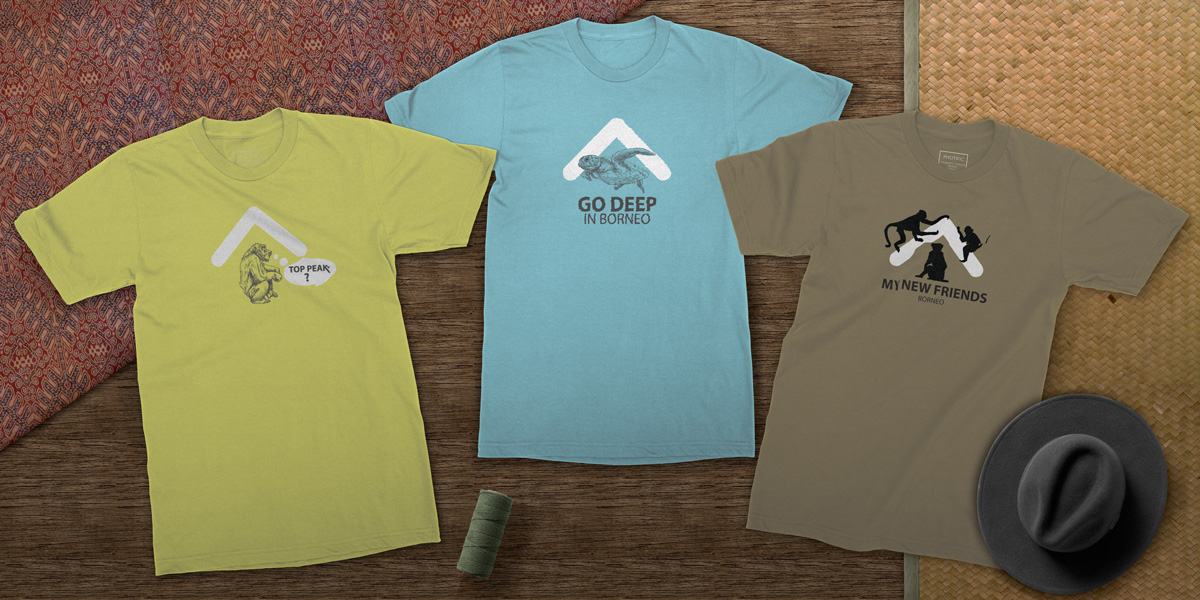
This sense of play was rolled into all of Top Peak’s branding materials. A series of candy-colored t-shirts embody the brand. They mix hand-drawn illustrations with cheeky taglines that capture the offbeat and surprising nature of travel. A group of postcard graphics were created with the same ripped paper motif used for their website. I used Borneo-specific imagery was used for these rather than the lifestyle-centric images selected for their website. The project was rounded out with a design for a branded transportation van used to transport clients to and from airports and other destinations.
